<Vogue> and <Happer Hazar> are fashion magazines people turn to the most to learn about fashion and style. Magazines have lost power as medium in the presence of mobile and social media mediums, but they still yield influence over numerous brands all over the world.
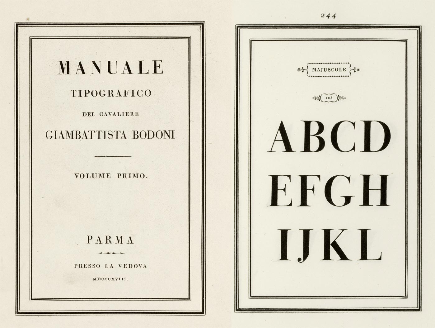
More details
The 1818 Manuale-Tipografico specimen manual of Bodoni’s press, published after his death.
The reason for every single word is to talk about the bodini font. Fashion magazine covers show as much sophistication, beauty, elegance, and luxury as they can. Among them the title is the moment when all the images are determined to match the eyes. A movie could be made of a story of a brilliant editor in chief of a fashion magazine, and the most representative of them are <Vogue> and <Happer Bazar>. These two use the bodini font stridently because it is such a beautiful and representative title font.
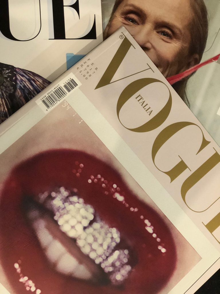
VOGUE

Harper’s BAZAAR 150th Anniversary Exhibition
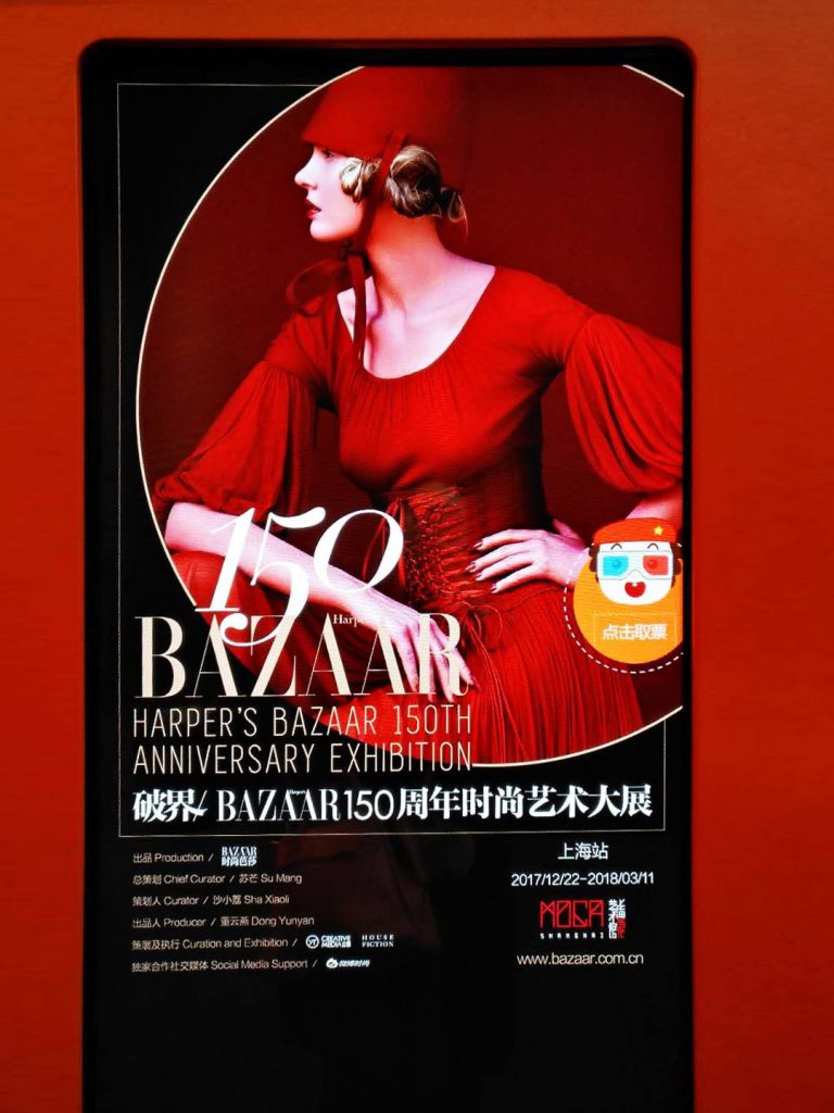
Harper’s BAZAAR 150th Anniversary Exhibition
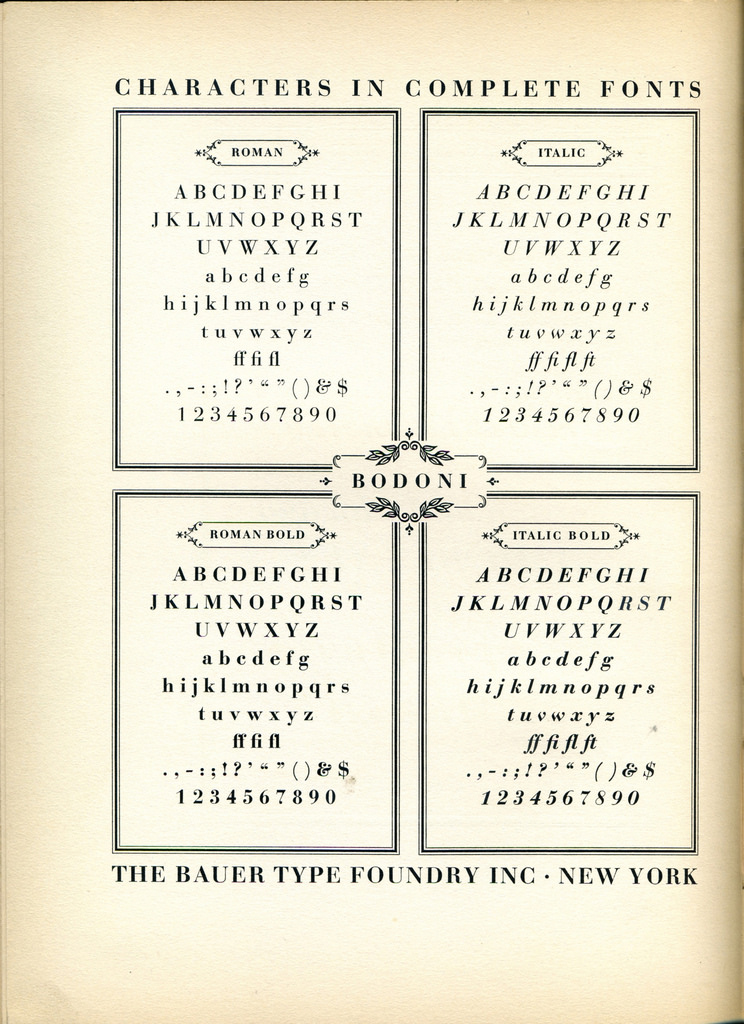
Bauer Bodoni Type Specimen
As the most beautiful and functional font, bodini is called the flower of Italian fonts. Most fonts in the 17th century were not refined because thin, narrow fonts could not be printed. It wasn’t until the 18th century that smooth paper was developed and print casting advanced enough to produce more refined fonts.
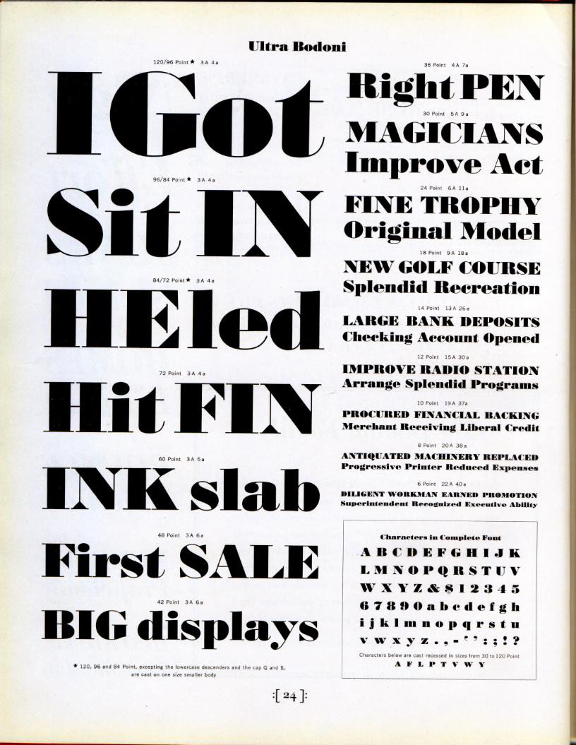
American Type Founder’s Ultra Bodoni font in metal type. A derivative of their Bodoni family, the design is not directly based on Bodoni’s own work but was very popular in advertising.
Bodini was created by giambattista Bodoni, a late 18th century Italian font designer. Bodini, who sculpted prints to help his father’s printing business, designed the font in 1787 and started revolution in typography history. He used his font for many of his own books and it was also used in many important literary works.
Giambattista Bodoni (1740 – 1813)
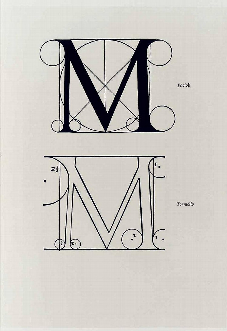
Bodini was constructed geometrically with serif making up the straight horizontal line and bold strokes coming together to create a mathematical yet classical and modern font.
The woodblock-printed edition of Homer’s <Iliad> is also known for this font. Bodini was used widely until the 19th century and seemed to disappear with the appearance various fonts. But it reappeared in the 20th century through morris Benton and is now beloved as a beautiful and sophisticated title font.
Refer to “Eum Design Academy,” “Korean Font Dictionary,” and “Naver Encyclopedia”

 Korea
Korea 中文
中文